For the final group data project of my Data Visualization course, we intend to explore data surrounding food insecurity in the local immigrant population while looking at its possible causes and government assistance. Also, migratory status is essential while looking at this issue because unauthorized immigrants, scilicet, have limited options to access food assistance and other social safety-net programs because of their immigration status — according to our research so far. Hence, while my project partner, Petra Wolf, explored the governmental aid obtainable for immigrant communities, I explored data on poverty and income as possible causes of food insecurity.
Both of us coincided with using the U.S. Census, which started with difficulties. Firstly, we should be more knowledgeable regarding the terminology. For example, the terminology for immigrant population data is generally categorized as nativity data, and its subcategories are “foreign-born,” “naturalized citizen,” and “not a citizen.” Understanding the different concepts and terminology was game-changing when searching for data. But, then, I (tete-a-tete) struggled to find data that matched similar periods to associate them organically — for example, poverty and income data from 2020 to 2021. But after a deep acknowledgment on the website, I found the Official income report and the Official Poverty Measure, with a national range from 2020 to 2021, supporting a more solid foundation for the research.
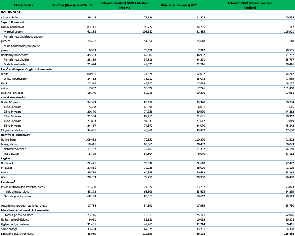
I wanted to see if there were poverty line disparities between US-born and foreign-born in the Census national data before going local. Therefore, I started with the income dataset cleaning; Excel and pivot tables were essential in the cleaning process. First, beginning with the original data set, which was cluttered by multiple null values and the margin of error:

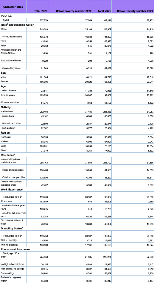
I decided to remove the null values and the margins of error because they provided context for me as the storyteller. Still, they were not manageable concerning the exactness and accuracy we needed to visualize the data and narrate the story. Therefore, the result clearly illustrates the householder’s characteristics, the population number, and the income estimate according to their category:
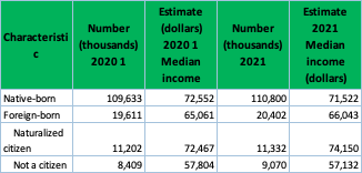
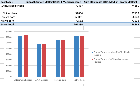
Then after cleaning, we start the extraction and pivot table + chart process to have a visual dimension of what each category means. First, we extracted the clean data by the population categories we were looking at, in this case, nativity only, and created a Pivot table to summarize the “immigrants” or “foreign-born” statistics, analyze and determine the disparities or patterns I was looking at. Then, we complemented with a Pivot chart that visualized the data with nativity characteristics as the axis and the sum of the estimated income from 2020 and 2022 as the added values:
Nativity:
Clean > Extract income data by nativity > Analyze > Pivot table > Pivot Chartj
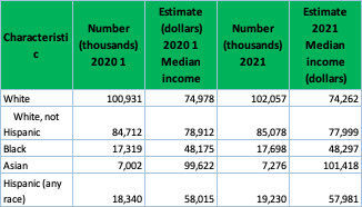
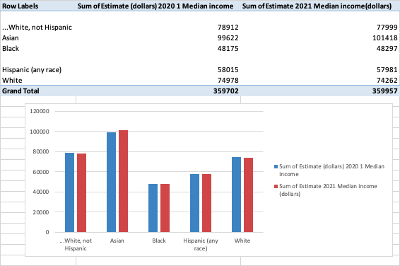
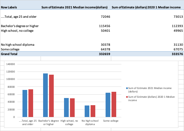
Accordingly, the same process was carried out with the income variance related to race and education level.
Race:
Clean > Extract income data by race > Analyze > Pivot table > Pivot Chart
Education:
Clean > Extract income data by education level > Analyze > Pivot table > Pivot Chart

Likewise, I wanted to explore whether there were poverty disparities or similarities between US-born and foreign-born in the Census data from 2020 to 2021 and the income data from the same range.
Original Official Poverty Measure data:
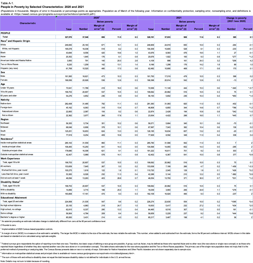
Hence, following the same process, I took the data to Excel and removed all the unnecessary data we would not use, including null values, negative percentages, and margin error:
Then, the extraction and pivot table process follows to have a visual dimension of what each set means:
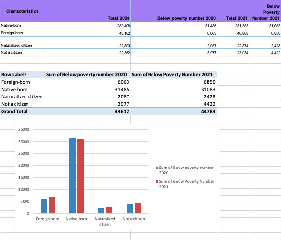
Nativity:
Clean > Extract poverty rate data by nativity > Analyze > Pivot table > Pivot Chart
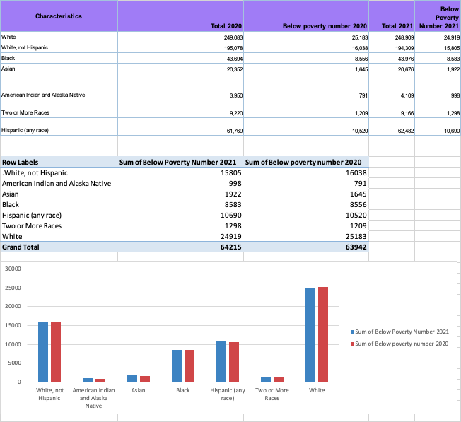
Race:
Clean > Extract poverty rate data by race > Analyze > Pivot table > Pivot Chart
Education:
Clean > Extract poverty rate data by education level > Analyze > Pivot table > Pivot Chart

On a final thought, the significant challenge in cleaning these datasets, besides the vocabulary, was understanding how much data I wanted to extract. At a certain point, it made me doubt myself because I thought it was not wholly evenhanded to take a fragment of data without using the other characteristics or mentioning their existence. However, my professor clarified that it was a need and pushed me through the proper cleaning and extraction of the data. Besides, the extraction of data and the usage of pivot tables and charts back up the narrative of the story we are trying to tell with more accuracy and briefness. This, in the process, also enables our understanding of how to search and explore other potential but closer data—context-wise—we are exploring for this project is focused on the local context of Boston; the foreign population by neighborhood, poverty rate by neighborhood, and income by neighborhood.
You can read Petra’s exploration journal here:
Previously posted in Medium by Sara Valentina Alvarez Echavarria:
Komentáře